Creating the Animation

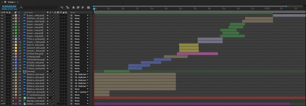
When creating the animation I followed the story board that I had previously drawn up and stuck to the pastel colours on a green scale that I have been using throughout.

Once I had drawn up all of my images on Photoshop I imported them into Adobe Aftereffects. I made sure to colour code the different parts and label them correctly to keep it organised and easy to follow when edititng.

12980779_1010451035706849_1215340424_o

Working with Adobe Voice

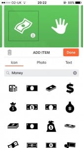
working with adobe voice was very useful in terms of creating a short animation with a voice over as it breaks up the animation into sections where you can record a short segment and add either an icon, photo or text.

12896230_992821644136455_1264584746_o


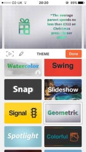
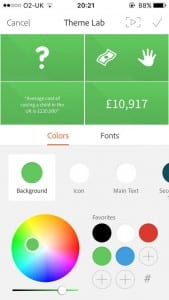
When I had finished the recording and animations it allows you to change the theme of the appearance. I decided to go for a simple green and white design to go with the general appearance of my product. It also allows you to choose a background song.

12903817_992821660803120_2017113308_o 12896252_992821670803119_2004957655_o12894454_992821657469787_1989956525_o

The end result ended up looking like this.

I was happy with the audio however the animation wasn’t quite what I had envisioned and so I decided to make an animation through Adobe Aftereffects to play with the audio.


Creating a Product

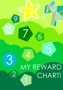
I planned on making a few products consisting of reward charts and stickers as the website sets up a good opportunity to do so.

I started looking at other products already on the internet.

Screen Shot 2016-04-15 at 04.56.31 Screen Shot 2016-04-15 at 04.57.46Screen Shot 2016-04-15 at 05.01.59 Screen Shot 2016-04-15 at 05.01.16 The price varied a lot. However I decided that I would keep the price cheap so the it is able to compete with the products already on the market. As i had figured out it would cost 22p to make both a poster and stickers, the price of the poster (reward chart) would cost £1 and £1 for 40 stickers (2 sheets) with half of the profits going to charity.

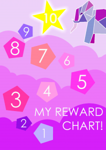
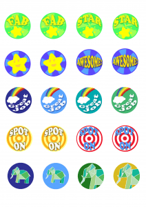
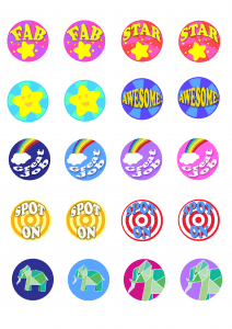
These are the end results. I intended them to be bright and colourful as they are for children. The logo is placed on them as well to ensure people know that the product it part of the TETCH brand, it would also get the logo more out there and more known.

reward chart boy reward chart

stickers stickers girl

Software for Web Design

When making a website last year the software I used was Adobe Dreamweaver. 


The software was useful and I was able to make a successful website thanks to it. However the task was not a simple one, making a website involves coding, this is not something I am familiar with.

This year we were introduced to other options of software that are useful in making websites. One of which was Adobe Muse. Muse does not involve any coding and so it is incredibly useful for people who do not know any of the codes to make a webpage.

Another one we were shown was a piece of software called Adobe Slate, though this was only shown briefly. Like Muse, it does not require knowledge in coding and is as simple as dragging an image in and clicking on the desired effect. It is different to muse in that it is simple to add effects to your website when you scroll down.Adobe's Slate presentation app makes its way to the web
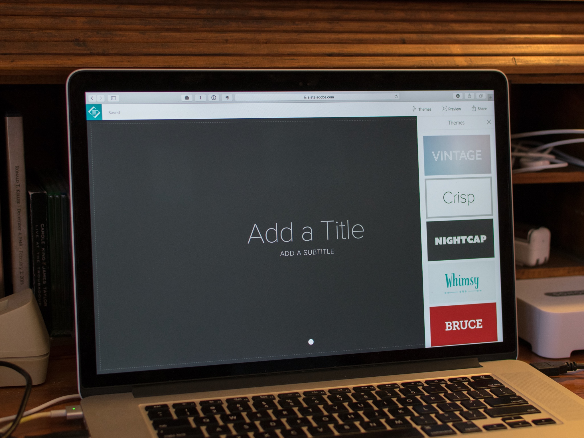
However for the optimum effect, you would need a lot of images which is something I don’t have. Though it is possible to use both Muse and Slate on the same website, so I could use the effect s in Slate for just one of my webpages and the rest using Muse.

The last Adobe package we were shown was not for web design but for making a short and simple animation, Adobe Voice. This only comes in form of an app, so the only way to use it is through an IPad or IPhone. it very simple in the way that you add what you want for imagery, whether it be an image, icon or text and say what you want in sections, the effect is then automatically applied at the end. It can then be exported and place in my website for example.

Overall I aim to use each of these pieces of software, excluding Dreamweaver, so that my website is kept interesting by having used a verity of techniques.
What Makes a Good Logo?

The five key factors to a successful logo are simplicity, memorable, versatile, timeless and appropriate.

One good example of a successful logo is McDonald’s golden arches. This logo is instantly recognised by everyone. The logo has not change a lot since the 1960’s.

One look that I find inspiring is the geometric look, which has a very simplistic appearance. One logo that uses the geometric look effectively is Enhance, a photoshopping app.

This is similar to the work of Tom Anders Watkins. His work consists of circular shapes and different shades of the same colour. I aim to make a logo that is similar to this design style.


As for what my logo would be in the image of my first thoughts was of making it into a shape of an animal. As the website is about guidance and parenting I wanted to pick an animal that is dependent in the early stages of life. The two animals I thought of was a bird and an elephant. I also thought that a tree would be a good representation of growth and development.

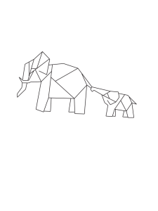
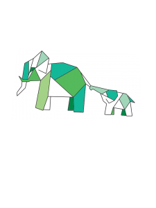
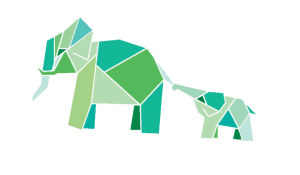
Out of the designs I sketched up, the one that I feel works best for my website it the mother and baby elephant as it resembles parenting and guidance. I took this da

elephantTETCH logo


Using the colours I had decided upon previously, I filled in the shapes making the elephant and this was the end result.