What Makes a Good Logo?

The five key factors to a successful logo are simplicity, memorable, versatile, timeless and appropriate.

One good example of a successful logo is McDonald’s golden arches. This logo is instantly recognised by everyone. The logo has not change a lot since the 1960’s.

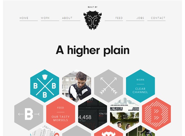
One look that I find inspiring is the geometric look, which has a very simplistic appearance. One logo that uses the geometric look effectively is Enhance, a photoshopping app.

This is similar to the work of Tom Anders Watkins. His work consists of circular shapes and different shades of the same colour. I aim to make a logo that is similar to this design style.


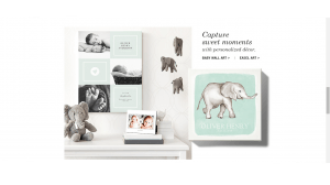
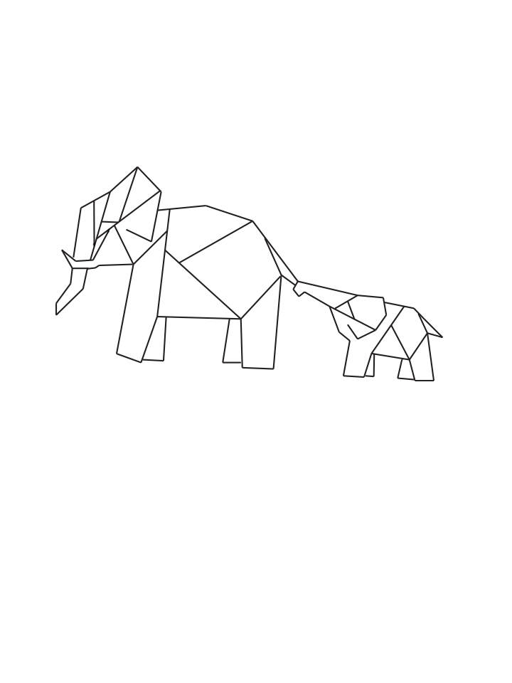
As for what my logo would be in the image of my first thoughts was of making it into a shape of an animal. As the website is about guidance and parenting I wanted to pick an animal that is dependent in the early stages of life. The two animals I thought of was a bird and an elephant. I also thought that a tree would be a good representation of growth and development.

Out of the designs I sketched up, the one that I feel works best for my website it the mother and baby elephant as it resembles parenting and guidance. I took this da

elephantTETCH logo


Using the colours I had decided upon previously, I filled in the shapes making the elephant and this was the end result.

Choosing A Colour Palette

It is important to put a lot of thought into the colours you choose to use as different colours have different meanings. For example, red could mean passion, danger or determination whereas white provokes feelings of cleanliness or innocence.
coloursAs my website addresses materialism, it would be good to use green as my primary colour as this colour is usually used to represent money and stability.

 green

My main target audience would be mothers, though I aim to appeal to both genders. Therefore, it would be best to use gender neutral colours. Green is not a feminine colour and so by using a green tint, it would increase the femininity of the appearance.

colours

Websites Directed at Parents

The selected target audience for my website is aimed at parents. More specifically parents of young children of that age of 3-7 as in this age, children are very susceptible to influences and so the parents of these children need to be aware of the effects of spoiling their children could have.

As I have an idea of the target audience, I decided to look at some websites that target the same people in order to find out what is successful and stands out in this market.

Change 4 Life

The first website that came to mind when thinking about websites for parenting was Change 4 life, a website about health. The design is very colourful which shows that it aims at children as well as their parents. The design is creative and fun, using bold colours. Yellow is used as the primary colour and has been used as blank space, which is usually a faded colour. As this is not the convention it stands out as a design.

However materialism is not a subject matter that would appeal to children and so they would not be as likely to go on the website. This gets me to question whether I should make a childish design if it is only going to be viewed by adults.

tinyprints

Not all websites directed at parents make a design that would interest children. For example, tinyprints, a website that sells announcement cards and other baby designs has a more mature and stylish . The design is sleek, but from making it look too cold and formal the use of pastel colours provides soft atmosphere. As this is for parents with newborns then it is no surprise that it is directed at adults.


Psychology of Web Design

For my product, I decided it would be best to make a Website to convey my idea. As this is the case I felt it would be useful to research the psychology behind web design so that my web design would be pleasing to my audience.

I found that to make a good website there needs to be an understanding of what is appealing to the audience. There are four major areas which have a big impact on the psychology of web visitors:

Content

  • People visit the site to access information and so it is the most important part of the website.
  • In today’s society we like to get quick access to what we need. Therefore content needs to be highly organised so that it is easy to find what you are looking for.
  • Too many words in one area can be overwhelming and stressful. It also makes it more difficult to find what information people are looking for. This means only the necessary information should be included and it should be split up into sections.

Space

  • White space plays a very important role. It acts as a visual resting space for the visitors so that they are not overwhelmed by a busy page.
  • Minimalism is a very popular design currently. This includes a lot of white space and no unnecessary clutter. The key is to keep it simple.

Colour

  • Colour affect how people feel and so its important to pick the right colour pallet and know what its conveying.
  • Neutral colours (such as tint and shades of black and white) should be used as they act as white space. This would then usually be used alongside with main colours. Neutral colours should take up the majority of the page to stop it from looking busy.
  • The type of colour can also have an impact:
    • Cool colours (blue, green)- Inviting and relaxed / cold.
    • Warm colours (yellow, red)- Warm and invokes creativity/ can invoke stress and anger.
    • White- Open atmosphere/ dull
    • Grey- Slick and modern/ uninviting
    • Black- Clean cut/ overpowering
  • A good way to make the website inviting is by using a combination of warm and cold colours so there is a balance.

Typography

  • There are many typefaces which are designed to be used in specific situations. For example, serif fonts are used for a traditional look, whereas sans serif is used for a modern look.
  • There are several other factors to conciser such as spacing. if the font is too tight, the website would feel crowded, more spaced out would convey an airy atmosphere, plus it is easier to read.
  • Another factor is font size. If too big it would feel like you are shouting the information to the reader, whereas too small would feel like whispering. You need to find the right balance.

 Buffalo

Minimalist website design inspiration: Buffalo

Buffalo is a web design company which successfully follows these rules.  Their website is clean and so therefore inviting, it has clear directions  without the need for lots of information. The colour pallet works well with mostly neutral colours (grey and black) with splashes of colour (blue and orange) which are toned down so they don’t take the full attention of the website. Sans serif is used to tie in with the modern style.