When working on a design it is easy to overlook certain aspects and rules that would enhance the quality of the aesthetics if followed. These are simple things such as the rule of thirds and getting the right balance in an image, whether that be using scale, contrast or brightness.
One design approach that always gets overlooked is atmospheric depth. Therefore I decided to create a couple of images considering depth and the balance of framing.
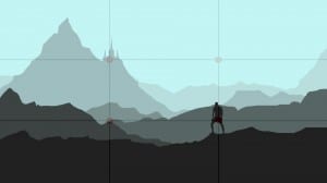
The main focus in this image is the man and the castle on the tower and so these two items were placed on the part where the two lines intersect as this is where the eye is most drawn to in an image. As the mountain is a larger scale than the man, the man is in a darker to balance out the two things. The Mountain is also a lighter shade as it is supposedly further away into the distance.
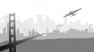
Another landscape I created was of a cityscape. This was done using the same principles as the previous one. How this time I included a bridge running through the different layers of depth. I managed to achieve this by putting a gradient effect on it so it looks as if it is going off into the distance.


