The selected target audience for my website is aimed at parents. More specifically parents of young children of that age of 3-7 as in this age, children are very susceptible to influences and so the parents of these children need to be aware of the effects of spoiling their children could have.
As I have an idea of the target audience, I decided to look at some websites that target the same people in order to find out what is successful and stands out in this market.
Change 4 Life
The first website that came to mind when thinking about websites for parenting was Change 4 life, a website about health. The design is very colourful which shows that it aims at children as well as their parents. The design is creative and fun, using bold colours. Yellow is used as the primary colour and has been used as blank space, which is usually a faded colour. As this is not the convention it stands out as a design.
However materialism is not a subject matter that would appeal to children and so they would not be as likely to go on the website. This gets me to question whether I should make a childish design if it is only going to be viewed by adults.
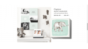
tinyprints
Not all websites directed at parents make a design that would interest children. For example, tinyprints, a website that sells announcement cards and other baby designs has a more mature and stylish . The design is sleek, but from making it look too cold and formal the use of pastel colours provides soft atmosphere. As this is for parents with newborns then it is no surprise that it is directed at adults.


